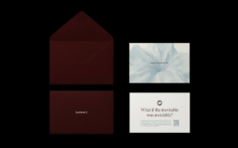
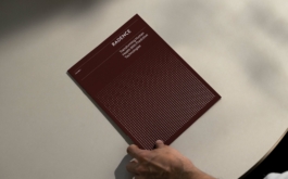
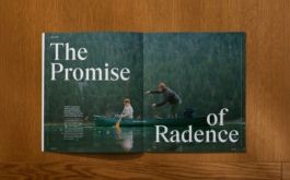
Radence
Brand Identity, Publishing Design, Web Design.
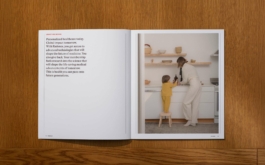
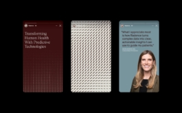
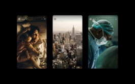
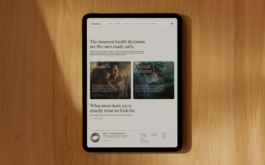
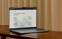
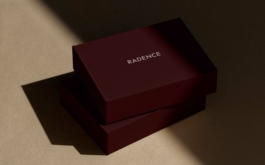
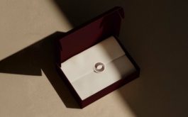
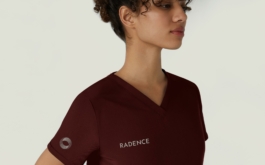
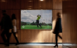
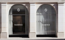
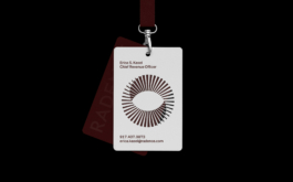
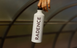
Radence is a precision health membership and early-detection platform that brings personalized, science-driven medicine into everyday life, elevating preventive care into a refined and luxurious experience.
The visual identity reflects this balance between innovation and reassurance. A warm, skin-toned color palette—soft beiges, muted blushes, and blue-grey accents—creates a calm, trustworthy, and high-end feel. The mark is inspired by the Möbius strip, a continuous form that blurs the boundary between inside and outside, symbolizing interconnectedness, transformation, and Radence’s holistic view of health. A kinetic graphic system expresses movement and progress, directly referencing the advanced technology behind the platform while remaining flexible across layouts and messaging. Photography art direction completes the system through an art direction rooted in honest moments of life, shaped by a truffle-toned warmth and soft slate-blue hues, reinforcing authenticity, care, and quiet confidence.
(1)


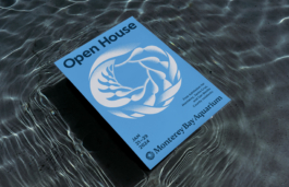
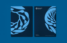
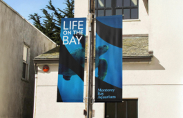
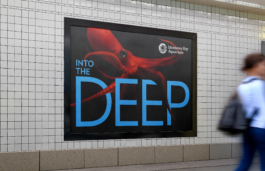
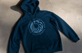
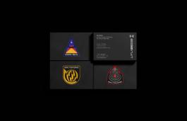
Monterey Bay Aquarium
Brand Identity, Brand Strategy.
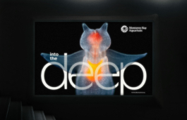
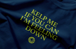
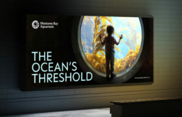
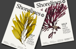
The Monterey Bay Aquarium in California, a leader in ocean conservation and education, has refreshed its brand ahead of its 40th anniversary. Known for its innovative exhibits and stunning location, the aquarium draws nearly two million visitors annually. The new branding honors the aquarium's legacy while incorporating modern design elements. The refreshed visual identity, inspired by kelp fronds, features simplified logos, new typography, and an expanded color palette reflecting the ocean’s depth. The redesign aims to enhance the aquarium's messaging across various platforms, emphasizing its commitment to marine conservation and education.
Partner: Abbott Miller
Made at Pentagram
(2)
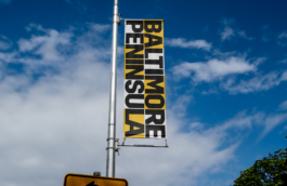
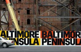
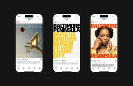
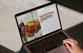
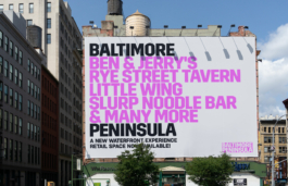
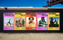
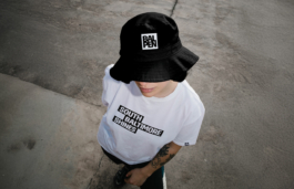
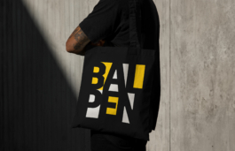
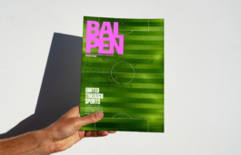
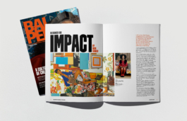
Baltimore Peninsula
Brand Identity, Publishing Design, Web Design.
The branding project for Baltimore Peninsula, a new real estate development in South Baltimore, draws inspiration from the neighborhood's industrial heritage. The logotype features a bold, faceted typeface with sharp edges, reminiscent of early 20th-century factory signage found in the area. This strong typographic style reflects the city's gritty, resilient spirit. Additionally, a magazine titled "BALPEN" was created to promote local events and the vibrant life of the community. The overall branding embraces boldness, with an impactful color palette that embodies the energy and character of Baltimore.
(3)
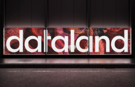
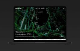
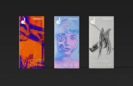
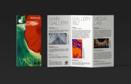
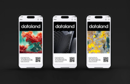
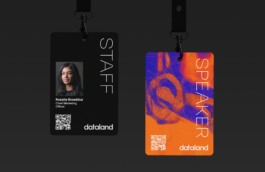
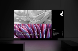
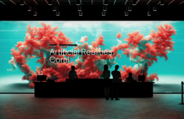
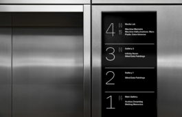
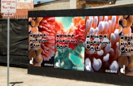
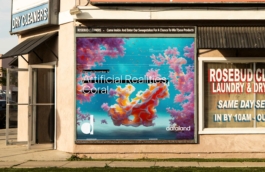
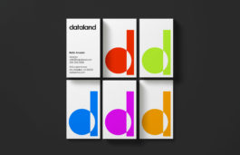
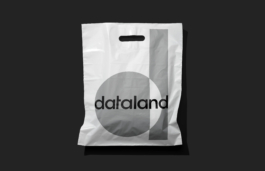
Dataland
Brand Identity, Exhibition Design.
Dataland is a new groundbreaking museum created by Refik Anadol in Los Angeles, celebrates the world’s first Museum of AI Arts and a digital ecosystem dedicated to data visualization and AI-based creativity. The wordmark features a custom geometric typeface inspired by Bauhaus aesthetics, blending rounded and hard-edge forms to reflect the interplay of technology and art. The simplicity of the mark complements the full wordmark, while the focus on binary elements (1’s and 0’s) reinforces its connection to data and AI. The primary typeface, Artex, is a bold and distinctive font family with alternate characters that emphasize radiused corners, encapsulating a strong technological spirit.
(4)
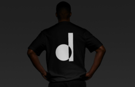
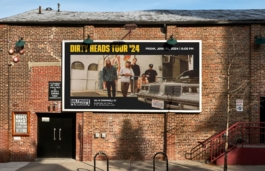
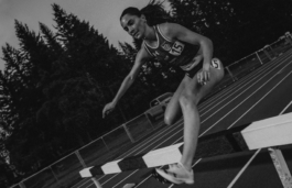
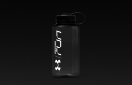
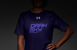
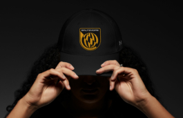
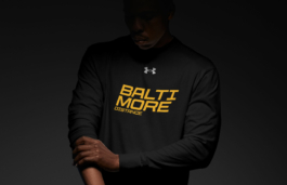
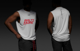
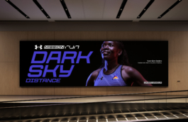
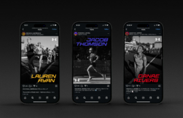
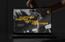
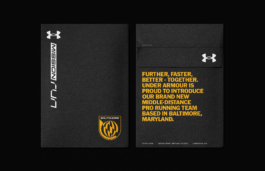
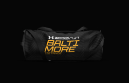
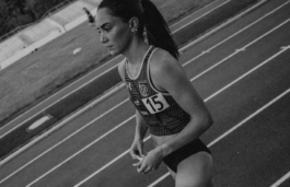
Under Armour Mission Run
Brand Identity
Under Armour Mission Run is the pro running team sponsored by Under Armour, with teams in Baltimore and Flagstaff. The branding system features custom blazons inspired by aerodynamic and NASA aesthetics, with each team's unique identity—Baltimore's urban energy and Flagstaff's rugged outdoor spirit—represented through various lockups and city-specific typography. This versatile design ensures the branding adapts seamlessly across all merchandise and gear, creating a cohesive yet flexible visual identity.
(5)
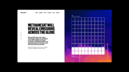
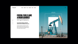
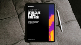
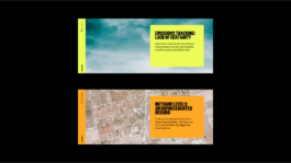
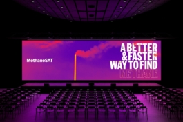
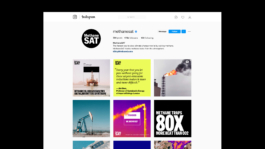
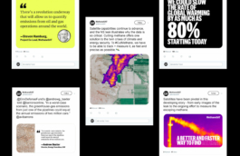
MethaneSAT
Brand Identity, Digital Design, Data Driven Design.
Visual identity, data visualization, and website for a new satellite that will orbit the Earth’s atmosphere to measure methane emissions.
An initiative of the Environmental Defense Fund (EDF), MethaneSAT represents a significant innovation in environmental monitoring and the fight against climate change.
New messaging was developed with the EDF team that would better communicate methane’s potency, positioning methane reduction as the ‘fastest way to curb climate change.
Partners: Abbott Miller and Giorgia Lupi
Made at Pentagram
(6)
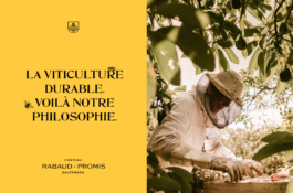
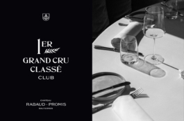
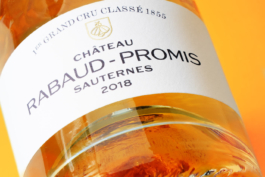
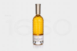
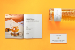
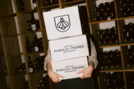
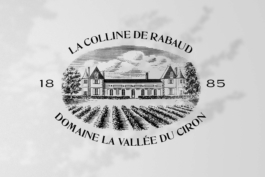
Château Rabaud-Promis
Branding, Packaging, Web Design.
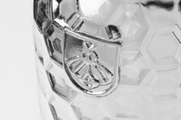
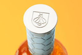
For Rabaud Promis branding, we developed an identity system that illustrates the biodiversity and tradition of wine-making. We created a "bee-blason" icon as a core brand element to embody Rabaud Promis's mission for sustainable viticulture, that they promote through unique, eco-friendly processes - such as owning multiple beehives at their estate. The main typography is inspired from a 1900s serif - a nod to the chateau's long time heritage.
The Rabaud Promis bottle showcases a combination of designs inspired from both liquor and traditional Bordeaux bottle shapes, as the wine itself can be enjoyed alone or as an infusion mixed into tasty cocktails. The bottle exudes an elixir aura through the unique honeycomb texture design, which also serves as another embodiment of the estate's strong vision for sustainability in the wine-making world.
Art direction & graphic design: Paul Lenaers
Made at Favoreat Design
(7)
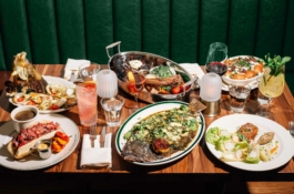
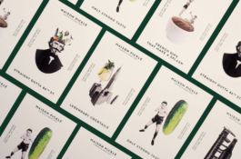
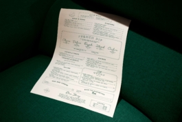
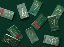
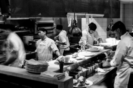
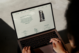
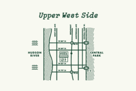
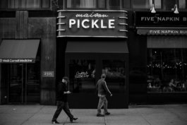
Maison Pickle
Branding, Web Design.
Owned by the influential Jacob Hadijgeorgis' hospitality group, Maison Pickle is an iconic New York bistro that serves American all-time classics and elevated cocktails to Manhattan's Upper West Side. The black and white imagery depicts moments and scenes throughout NYC's history that molded the city into its identity today. The retro iconography is a compilation of playful collage illustrations that combines these historic NYC moments with the food and ingredients found at Maison Pickle.
Art direction & graphic design: Paul Lenaers
Made at Favoreat Design
(8)
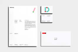
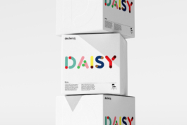
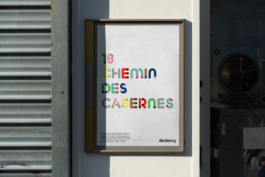
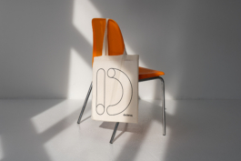
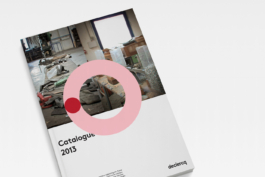
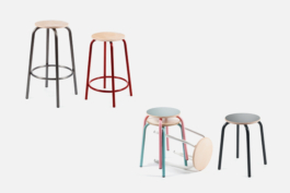
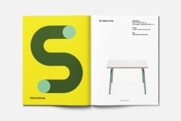
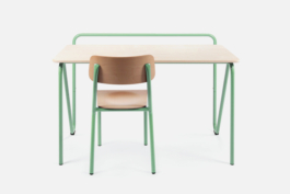
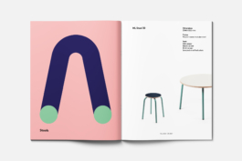
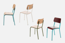
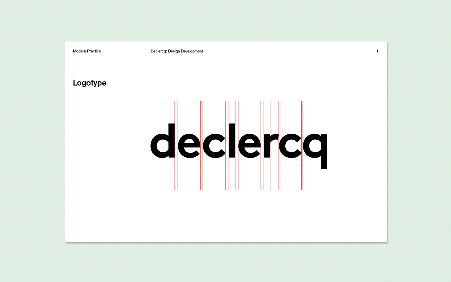
Declercq Mobilier
Branding, Packaging, Web Design.
For Declercq's branding, we developed an identity system that focuses on the art of tube bending - a technique central to every manufactured product at the company.
From that concept, we created a complete toolbox which includes a logotype, a typeface, and a visual language that allows us to make a wide range of implementations (stationary, folders, website...).
Art direction: Julien Van Havere and Matthieu Regout
Graphic design: Paul Lenaers
Made at Modern Practice.
(9)


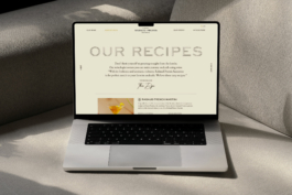
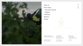
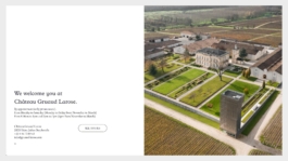
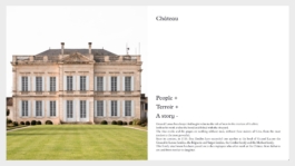
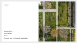
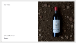
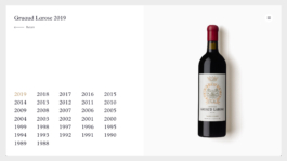
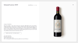
Chateau Gruaud Larose
Web Design
To illustrate the beauty of the Bordeaux wines from Saint-Julien appellation, we focused on a minimalist design for Chateau Gruaud Larose that feature various photographs and videos of the estate and their wine-making process. The website is designed in such a way to manifest a real-life experience as if you are present at the estate. In order to create an accessible way to start the full experience at Chateau Gruaud Larose estate, we developed an intuitive way to secure reservations through the website.
Art direction & graphic design: Paul Lenaers
Made at Favoreat Design
(10)
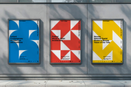
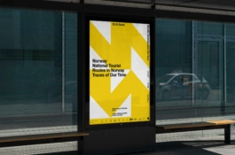
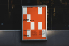
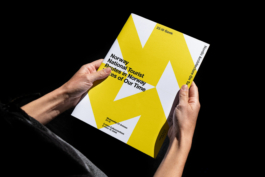
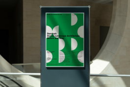
Nordic Architecture On Tour
Branding, Poster Design.
Curated by the Finnish Cultural Institute, Nordic Architecture On Tour is a series of lectures that focus on the Scandinavian architectural and design culture. With the limitations to not use any images for this project, we created a visual system using shapes and colors that symbolize each country the lecture was based on. The posters follow the same gridlines and, therefore, creates a vibrant and dynamic pattern and alignment when exhibited altogether.
Art direction: Julien Van Havere
Graphic design: Paul Lenaers
Made at Modern Practice.
(11)